
Photo repair
We started out by using the "clone stamp tool" and other tools to fix photographs. For this we were given an old photograph and asked to mend all the scratches and patches commonly found on old printed film photos. However I have chosen to use a photograph of my grandad to show you the same thing. Here are both the before and after.
I used both the clone stamp and the spot healing brush tool to remove marks and bends from this photograph. I also adjusted the levels slightly to make the whole thing clearer.


Levels
We were taught how to change the 'levels' in our photos to both enhance/fix colours and to draw out more detail.

You can see how in this example by changing the levels it just helps to add a little more tone to the photograph and bring the colours forward to be closer to how the eye would have seen them. The camera picks up a lot of detail that the photograph might not then show, this simply helps to bring out what is already there.
Weekly Projects
After learning these techniques our class chose a subject or a style of photography each week for us to try. These were set to test not only our ability to take photographs in the first place but also to challenge our post production skills.Smoke Trails
For this week we were tasked with capturing smoke trails. To do this myself and two of my classmates set up a table in the studio (not sure how we didn't set the smoke alarms off). We set up a black back drop behind and to the side of the table and used a flash gun to light the smoke which we produced with incense sticks. We put the incense sticks into the top of a bottle so that we could take the photos without having to old or re adjust.

To create a more effective final image I used the levels option in photoshop just to darken the background. Image 1 has not been edited other than to crop whereas image 2 has had it's background darkened. This to me created a much more visually pleasing photograph and was the result I was originally looking for.
To create image 3 I started by darkening the background as with image 2 but then changed the smoke colour using the Hue/Saturation option. This was a lot of fun and I toyed with many colours before settling on the pink. Changing the Hue/Saturation is always good fun and very effective in giving a photograph an entirely new look.


To create this look I chose to Invert the original image, this is easy to do, the option can be found in the 'image' menu in photoshop in the 'adjustments' section. After inverting the photograph i then changed the colour using the levels option and by choosing to change each colour level individually.


Temperature
For this week we were asked for a photograph that somehow showed the idea of temperature. I thought about this one for some time trying to come up with an idea about the representation of temperature and how to show it, but while looking through some of my older photos I came across this one and thought that it was perfect. There is nothing that says summer time and hot sun more than children playing in the park. This is a photograph of my daughter playing at Lydiard park last summer, it was a beautiful warm day and I think that warm temperature is conveyed well due to the bright colours and bleached ground coupled with the dark contrast of the shadows.
I needed to edit this one very little, I cropped it to remove unnecessary background and changed the levels ever so slightly just to make the shadows that little bit darker.

Street Photography
A lot of street photography I have noticed is done in black and white however I am a fairly colourful person and like lots of bright and vibrant colours, a couple of years back on a coach trip to London i spotted these buildings and loved the colours. The photo was taken out of the window of the coach and although cloudy it was a bright day. This was a matter of days after getting my new camera and i was still working out how to use it and as the coach was moving i had little time to readjust so was more than slightly disappointed with the way it came out.

Now, several years including 2 years of uni later I can happily say I have the knowledge to fix the photograph and get the results that I intended in the first place. To start with I simply changed the levels, bringing the highlights down to where there was information in the image and allowing the colours and lost detail to show through.

Although I was pleased even with this results I then took the photo into the Shadows/Highlights... option to bring the colours out even more, as this is what I originally wanted to show. I am very pleased with the outcome and amazed at the amount of detail that is still captured in a photograph even when you think it hasn't caught what you wanted to show.

Food
This week it was Food! I enjoyed shooting these almost as much as i enjoyed eating them afterwards.
For this first photo I wanted to show something quite simple and traditional. I think it works well and I could easily see it in a food magazine somewhere. It didn't take much post production at all and i'm very pleased with it. The only thing I would change did I do it again would be that the grain of wood underneath is not aligned right and drifts to the left, I would try and position it so that they matched up slightly better on each side.


Levitation
This task was to create the illusion of levitation.


So to start with I took a photograph of the background and then one with my model in front, then I cut the model out of the first image and placed it over the background. After that I lowered the opacity of the second image so I could see the difference between the two and proceeded to turn the transformation controls on (these can be found in the toolbar above the workspace) this gave me the ability to change the size and alignment of the second layer until it was perfectly aligned with the background layer.


After this I turned the opacity back up to full and then simply erased the stool from under my model. It was a simple as that, a surreal looking levitation image in very easy steps.
I do however think if I were to do it again I would use a slightly lower angle just to enhance the effect and make it a bit more obvious.

Focus Stacking
Although photoshop as tried to layer the photos correctly there are at least 3 major screw ups in this photo...

Triptych
This week we were tasked with creating a Triptych. I enjoyed this one very much as there is so much you can do with it whether that be changing the photographs you use or the size of the borders etc.
To start with you need to create a page the size of the final image you wish to create, for this one I've chosen A4. Then switch on the grid from the 'view' menu as this makes it a whole lot easier to measure your boxes.


Montage

Reshoot an Iconic Image
For this week I have decided to try and replicate 'The Afghan Girl'
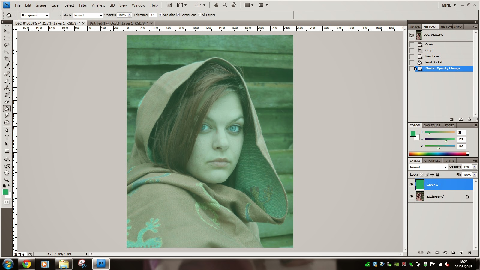


To start with I wanted to make the background greener to match the original image. To do this I added a green layer, then erased the green from over the model before lowering the opacity so that the detail of the background would still show through.


I then altered both the levels and the Shadows/Highlights to bring out the colours and make the image more vibrant. after this I erased the background as I wanted that to remain fairly light as per the original image.


Finally I smoothed the skin slightly to remove blemishes and then added a brown layer over the top to add tan, I then lowered the opacity of this layer so it looked more natural before erasing the whites of the eyes on both this and the layer below to bring out the original bright eye colour.
And here is the result, my version of 'The Afghan Girl'

Pseudo HDR (shadow & highlight recovery)
Our task this week was to recover shadow and highlight detail that may not be showing to create a photograph with an HDR effect. to do this I took a photograph that i had that was taken late in the evening so a lot of the highlights that were visible during the sunshine of the day were now harder to see.

I then took this photograph into photoshop and subjected it to photoshops Shadows/Highlights.... option that can be found in the 'image' menu under 'adjustments'. To get as much detail in the clouds as possible I would suggest increasing the 'tonal width' on the highlights. Also colours are brought forward and exaggerated by increasing the colour correction however if you set this too high then the colours become too much and start to distort your photograph.


Evaluating the work of others
Our final task in this project was to evaluate the work of others. to do this I have chosen some images created by others in my class.
This photograph was taken by AJ of AJ Thomas Photography , This was for our 'food' task. The photograph is stunning, The shallow depth of field and the overall tone of the photo work in harmony to create a both visually pleasing and technically skillful photograph. Knowing AJ and how he works I doubt there would have been much post production work in this at all. He likes to set everything up so that it needs as little editing as possible. the photo was probably cropped slightly and may have had the colour alters a little with the levels but other than that I would have thought there would be very little else done. I like this photo very much and it's something i would quite hapipily hang in my dining room for that splash of colour and ambiance.

This one was done by Diandra of A Digital Way of Life. I can't get enough of this photo. The idea is brilliant and the execution is perfect. As is always the way with Diandra she has managed to inject that little bit of humour into her photo. This was done for 'levitation' and frankly is perfect! It was done with layers by taking a shot of the background and then a shot with the model in front. She has removed the unwanted part of the model very carefully as to not miss any bit or overdo it even down to making sure the shadow matched.

And finally this one taken by Leanne of One Stop Photography. This was also taken for 'levitation'. I actually have no idea how this one was done but I think it's wonderful. It's completely different from all the other pieces in the class from this task. I think that the black and white is very effective and the lighting effect really helps the overall feel of the photo. I would think that the background has been darkened and that perhaps the tones have been changed slightly to add that bit more depth. I think the photo is fantastic and I could imagine seeing him at some dark, spooky circus!
Evaluation
I have enjoyed this project a great deal. I feel that I have learned many new techniques and gained a great deal of experience via trying them. The only downfall has been from myself as due to complications with my health because of my pregnancy I have struggled to keep up, However I am pleased with what I have achieved and feel that within every single task I have learned things that can be incorporated within all aspects of my photography. I feel my abilities in post production have improved immensely and are continuing to do so. When I look at photographs I took and edited not even a year ago I can see how far I have come. I have enjoyed the weekly tasks and think this is a brilliant way to keep up with taking the photos you need to continually improve and I think I will be continuing with this after uni is finished and my baby is born. This is in my opinion one of the best projects we have had simply because the skills gained are so transferable to all genres of photography not just the ones we have tried and it makes me very happy to be able to witness my own improvement.
I hope you have enjoyed reading it as much as I did creating it!
A fascinating read. Beautiful photography. The London buildings and the afghan girl repo are particular favourites. Well done x
ReplyDelete